What Is Technical Analysis in Crypto Trading: Complete Beginner Guide (2026)
— By Tony Rabbit in Tutorials
What is technical analysis in crypto? Complete 2026 guide: candlestick patterns, top 6 indicators (RSI, MACD, MAs, Bollinger, Fibonacci, Volume), chart patterns and crypto-specific TA.
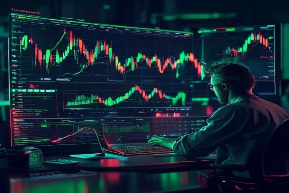
If you have ever stared at a crypto price chart wondering why everyone keeps talking about candlesticks, moving averages, and "the 200-day," you have already brushed against technical analysis. Technical analysis, or TA, is the discipline of reading price and volume data to predict where a market is likely to move next. It is the dominant decision-making framework for short-term and medium-term crypto traders in 2026, and even long-term investors quietly use it to time their entries.
Unlike fundamental analysis, which evaluates the intrinsic value of an asset, technical analysis assumes the chart itself contains every piece of information you need. Every news headline, insider whisper, on-chain flow, and emotional reaction is already baked into price. Traders who follow TA do not try to predict what an asset is worth. They try to predict what the crowd will do next, because in the short run, markets are driven by behavior, not value.
This guide is a complete walkthrough of technical analysis specifically tailored for crypto. We will cover the philosophical foundations laid down by Charles Dow over a century ago, the anatomy of a candlestick, the eight candlestick patterns every trader should recognize, the six indicators that actually matter in 2026, the most reliable chart patterns, the crypto-specific quirks of a 24/7 market, an honest assessment of whether TA actually works, and the best charting platforms to use today. By the end, you will have a complete mental toolkit to start reading any crypto chart with confidence.
What Is Technical Analysis
Technical analysis is the study of historical price and volume data with the goal of forecasting future market behavior. The term was popularized by Charles Dow, the founder of The Wall Street Journal and creator of the Dow Jones Industrial Average, in a series of editorials published between 1899 and 1902. Dow never wrote a formal book on his methods, but his ideas were later compiled by his successors into what is now known as Dow Theory, the foundation of all modern technical analysis.
The core insight is simple: prices are not random. They reflect the collective psychology of every market participant. Greed pushes prices up, fear pulls them down, and the resulting patterns repeat across decades and across asset classes. Whether you are looking at a chart of railroad stocks from 1920, gold futures from 1980, or Bitcoin from yesterday, the same shapes appear because the same emotions drive every trader who has ever placed an order.
In the digital age, technical analysis has evolved dramatically. The early Dow followers had to plot prices by hand on graph paper. Today, platforms like TradingView and DEXTools deliver real-time interactive charts to your phone with hundreds of built-in indicators, automated pattern recognition, and one-click backtesting. Algorithmic trading systems now execute TA-based strategies in microseconds, and machine learning models attempt to find patterns that human eyes miss. Yet despite all this technological progress, the fundamental principles that Dow articulated more than 120 years ago remain the bedrock of how traders read markets.
The 3 Core TA Assumptions
Every technical analyst, whether they realize it or not, operates on three foundational assumptions. These were formalized by Dow and refined by later writers like Robert Edwards and John Magee. Understanding these assumptions is critical because if you do not believe them, no amount of indicator study will help you. The entire methodology rests on this philosophical foundation.
Assumption 1: The market discounts everything. This is the most important and most controversial idea in technical analysis. It states that the current price of an asset already reflects all available information, including economic data, fundamental factors, political events, market sentiment, and even insider knowledge. If a Bitcoin whale knows about an upcoming exchange listing, their buying activity moves the price before the news becomes public. By the time you read the announcement, the move has already happened. Technical analysts argue that since price contains all information, you only need to study price.
Assumption 2: Prices move in trends. Markets do not wander randomly. They move in identifiable trends that can persist for weeks, months, or even years. Once a trend establishes itself, it is more likely to continue than to reverse. This is why traders use moving averages and trendlines to identify the direction of the prevailing trend and then trade in alignment with it. The famous trader Jesse Livermore summed it up: "The big money is not in the buying or the selling, but in the waiting."
Assumption 3: History repeats itself. Human psychology does not change. The same patterns of fear and greed that produced the tulip mania of 1637 produced the dotcom bubble of 2000, the Bitcoin parabola of 2017, and the meme coin frenzy of 2024. Because the same emotions drive markets across centuries, the same chart patterns appear again and again. A head and shoulders top in 1929 looks identical to one forming in Ethereum today, and it tends to resolve the same way.
Candlestick Anatomy
Before you can read any pattern, you must understand the candlestick itself. Candlesticks originated in 18th-century Japan, where rice trader Munehisa Homma developed them to track price action in the Osaka rice market. They were introduced to the Western world by Steve Nison in his 1991 book "Japanese Candlestick Charting Techniques," and they have since become the default chart type for almost every crypto trader.
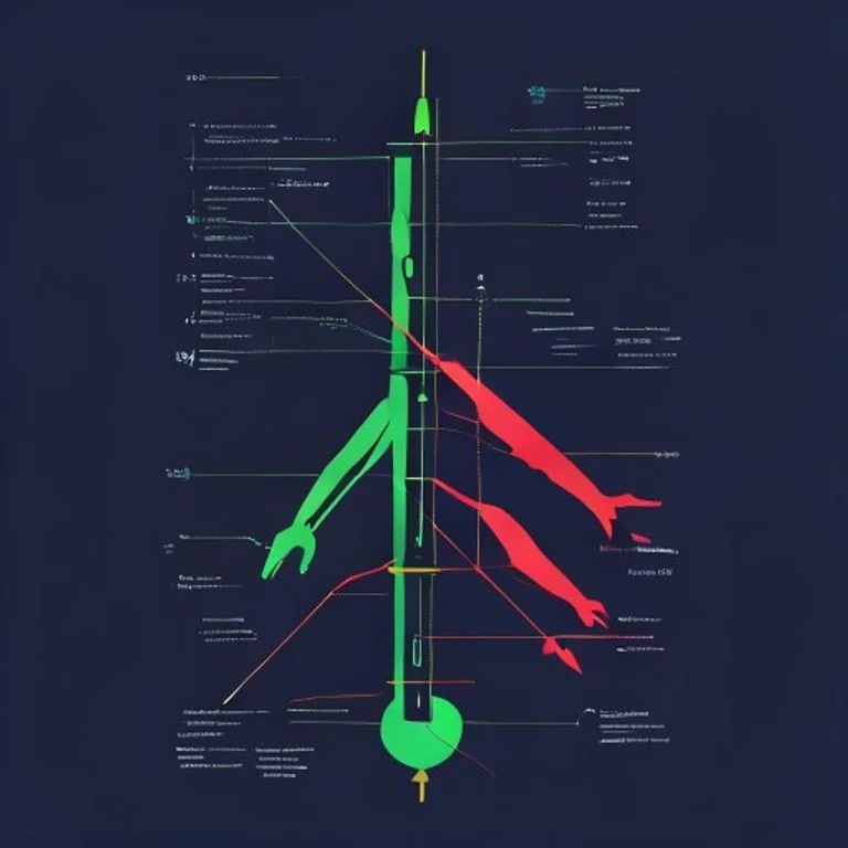
A single candle represents the price action of a specific time period. On a 1-hour chart, each candle shows what happened in one hour. On a daily chart, each candle represents one day. Every candle has four data points: the opening price, the closing price, the highest price reached, and the lowest price reached during that period. These four numbers are encoded in the candle's visual structure.
The body tells you who won the period: buyers or sellers. A long green body means buyers dominated. A long red body means sellers crushed the market. The wick tells you about the fight: long wicks mean strong rejection at those levels, while short or absent wicks mean one side maintained control throughout the period. Reading these subtle clues across consecutive candles is the foundation of all pattern recognition.
Top 8 Candlestick Patterns
While there are dozens of named candlestick patterns, eight of them appear so frequently in crypto charts that mastering them will cover the majority of real-world setups. These patterns work best at significant support and resistance levels, especially after a clear preceding trend. They are most reliable on higher timeframes (4-hour, daily, weekly) because the noise on lower timeframes produces too many false signals.
Beginners often make the mistake of trading every candlestick pattern they see. This is a fast way to lose money. The reliability of these patterns depends entirely on context. A bullish engulfing candle on a 5-minute chart in the middle of a strong downtrend means almost nothing. The same pattern on the daily chart at a major support level after weeks of selling is a high-probability setup. Always combine candlestick patterns with structural analysis: where is the candle forming relative to support, resistance, and the broader trend?
The 6 Most Useful Indicators
Technical indicators are mathematical calculations based on price and volume that traders overlay on charts to identify potential entries, exits, and trend strength. There are thousands of indicators available on modern charting platforms, but the vast majority of professional traders rely on a small core set. Stacking ten indicators on a single chart produces noise, not insight. The six below are the ones that show up in nearly every professional crypto trading setup.
RSI Deep Dive
The Relative Strength Index, abbreviated RSI, was developed by J. Welles Wilder Jr. in 1978 and remains the most universally used momentum indicator in crypto. It measures the speed and magnitude of recent price changes on a scale from 0 to 100. The classic interpretation: RSI above 70 means an asset is overbought and due for a pullback, while RSI below 30 means it is oversold and may be ready to bounce.
This simple framework is a useful starting point, but crypto traders quickly discover its limitations. In strong bull markets, RSI can stay above 70 for weeks. In capitulation events, it can sit below 30 for days. Trading purely based on the 70/30 levels in crypto is a known way to get repeatedly stopped out. The more sophisticated application is RSI divergence: when price makes a new high but RSI fails to make a new high, the underlying momentum is weakening, and a reversal is statistically more likely. Bullish divergence works the opposite way at the bottom of moves.
For a full breakdown of how to use this indicator for crypto trading, see our complete RSI guide. The standard period setting is 14, meaning RSI considers the last 14 candles. Some traders shorten this to 7 for faster signals on lower timeframes, or extend it to 21 for smoother readings on higher timeframes. There is no "correct" setting, only settings that suit your specific trading style.
MACD Deep Dive
The MACD (Moving Average Convergence Divergence) was developed by Gerald Appel in the late 1970s. It is a trend-following momentum indicator that captures the relationship between two exponential moving averages of the price. The default settings are 12, 26, and 9, meaning MACD subtracts the 26-period EMA from the 12-period EMA, and then plots a 9-period EMA of that result as the signal line.
MACD produces three pieces of information. First, the MACD line itself shows the momentum of the asset. When it crosses above the signal line, it generates a bullish signal. When it crosses below, it generates a bearish signal. Second, the histogram shows the distance between the MACD line and the signal line. When the histogram grows, momentum is accelerating. When it shrinks, momentum is fading. Third, the relationship of MACD to the zero line reveals the broader trend: above zero is bullish, below zero is bearish.
The most powerful MACD setups occur when crossovers happen on higher timeframes after extended consolidation. A bullish MACD cross on the daily chart of Bitcoin after a multi-week sideways period has historically produced reliable upside moves. Like all indicators, MACD generates false signals during choppy markets. Combining it with structural analysis and other confirmations is essential.
Moving Averages: SMA vs EMA
Moving averages are the simplest and most widely used technical indicators in existence. A Simple Moving Average SMA calculates the average closing price over a specified number of periods. A 50-day SMA on Bitcoin sums the last 50 daily closing prices and divides by 50. It updates with each new candle and is plotted as a smooth line beneath the price action.
An Exponential Moving Average EMA works similarly but gives more weight to recent prices. This makes EMA more responsive to current market conditions, while SMA reacts more slowly. Day traders generally prefer EMAs because they signal trend changes faster. Long-term investors often use SMAs because the slower response filters out noise.
The two most famous moving average events are the golden cross and the death cross. A golden cross occurs when a shorter moving average (typically the 50-day) crosses above a longer one (typically the 200-day). Historically, this signals the beginning of a major bull trend. A death cross is the opposite: the 50-day crosses below the 200-day, signaling a major bearish phase. Both events have produced large directional moves in Bitcoin throughout its history, though they are lagging indicators that trigger after the move has already begun.
Moving averages also serve as dynamic support and resistance. During strong uptrends, price often pulls back to the 20-EMA or 50-EMA before continuing higher. These pullbacks are textbook buy-the-dip opportunities for trend followers. The 200-day moving average specifically is watched by institutional traders across all markets and frequently produces bounces or rejections.
Bollinger Bands: Volatility Squeeze Setups
Bollinger Bands were created by John Bollinger in the 1980s and consist of three lines: a 20-period simple moving average in the middle, an upper band that is two standard deviations above the SMA, and a lower band that is two standard deviations below. Because the bands expand and contract based on volatility, they provide a visual map of how stretched or compressed the market is at any moment.
The most actionable Bollinger Band setup is the squeeze. When the bands contract tightly around price for an extended period, it indicates that volatility has collapsed. Markets cycle between low volatility and high volatility, never staying in either state for long. A prolonged squeeze almost always resolves with a sharp expansion in either direction. Traders watch for the squeeze, then enter in the direction of the breakout once the bands begin to widen.
Touching the upper band does not automatically mean an asset is overbought, and touching the lower band does not automatically mean it is oversold. In strong trends, prices ride the bands for extended periods. The bands are a volatility tool, not a momentum oscillator. Combine them with RSI, volume, and structural analysis to filter false signals.
Fibonacci Retracement Levels
Fibonacci retracement is one of the most strangely effective tools in technical analysis. It is based on the Fibonacci sequence, a mathematical pattern discovered by Italian mathematician Leonardo of Pisa in the 13th century, where each number is the sum of the two preceding ones (1, 1, 2, 3, 5, 8, 13, 21, 34...). Ratios derived from this sequence appear throughout nature, art, and apparently financial markets.
To apply Fibonacci retracement, you identify a significant price move, then draw horizontal levels at 23.6%, 38.2%, 50%, 61.8%, and 78.6% of that move. These levels frequently act as support during pullbacks in uptrends, or resistance during bounces in downtrends. The 61.8% level, also called the golden ratio, is the most watched and tends to produce the strongest reactions.
The 50% level is not technically a Fibonacci ratio but is included by tradition because it is the midpoint of any move and tends to act as a psychological support. Many crypto traders use Fibonacci levels in combination with horizontal support and resistance. When a Fibonacci level coincides with a previous high or low, the confluence creates a much higher-probability reaction zone.
Volume Profile and Support/Resistance
Volume is the fuel of every price move. Without volume, even the most beautiful breakout is suspect. Two volume-based tools dominate professional crypto trading: standard volume bars and the Volume Profile. Standard volume bars are plotted at the bottom of the chart and show how many units traded during each candle period. A breakout accompanied by a massive volume spike is dramatically more reliable than one on thin volume.
Volume Profile is a more sophisticated tool that shows volume distributed across price levels rather than time. It displays a horizontal histogram on the chart, where each bar shows how much trading activity occurred at that specific price. The level with the highest volume is called the Point of Control (POC), and it acts as a powerful magnet for price. Areas of high volume typically become support or resistance, while low-volume nodes get traversed quickly.
Two volume-based indicators worth mentioning are the Money Flow Index MFI and On-Balance Volume OBV. MFI is essentially RSI weighted by volume, providing a more accurate read of buying versus selling pressure. OBV is a cumulative line that adds volume on green days and subtracts it on red days, revealing whether smart money is accumulating or distributing even when price moves sideways.
Chart Patterns
Chart patterns are larger structural formations that emerge across many candles. Unlike candlestick patterns, which are 1-3 candles long, chart patterns can take weeks or months to complete. They represent extended battles between buyers and sellers and tend to produce the most reliable directional moves once they resolve.
The key to trading chart patterns is patience. A head and shoulders pattern is not confirmed until price breaks below the neckline with volume. A triangle is not actionable until the breakout candle closes outside the boundary. Many beginners jump in too early, predicting the breakout direction before it happens, and get caught on the wrong side of false moves. Wait for confirmation, then enter with a clear invalidation level.
Crypto-Specific TA Differences
Most TA literature was written for traditional stock and futures markets, but crypto has several structural differences that change how technical analysis works in practice. Ignoring these differences leads to repeated mistakes that experienced crypto traders learn to anticipate.
24/7 trading with no closes. Stock markets close every evening and on weekends. Crypto never closes. This means there are no opening gaps, no closing prints, and no overnight halt. The concept of a "daily candle" is somewhat arbitrary because daily candles are typically defined by UTC time, which is not when major moves cluster. Many crypto traders adjust their daily candle to close at 00:00 UTC, while others prefer the 00:00 EST close to align with US market sentiment.
The weekend effect. Despite trading 24/7, crypto volume drops substantially on weekends because institutional desks are closed. This produces thinner liquidity and more erratic price action from Friday evening through Sunday. Many traders avoid taking new positions over the weekend or use tighter stops because volatility can spike unpredictably on low volume.
Low-liquidity altcoin failure modes. Technical analysis works on Bitcoin and Ethereum because they have deep liquidity and millions of participants. On small-cap altcoins with low liquidity, TA breaks down. A single whale can manipulate the chart, painting fake patterns to trap retail traders. Stop hunts are common, with prices wicking through key levels just long enough to liquidate longs or shorts before reversing. Always check liquidity and volume before applying TA to lower-cap tokens.
Funding rates and perpetual futures. Crypto's perpetual futures markets introduce a unique dynamic absent from traditional TA. When funding rates are extremely positive, longs are paying shorts and the market is over-leveraged on the bullish side, making it vulnerable to a long squeeze. Funding-aware traders integrate this data with their chart analysis to identify high-probability mean reversion setups.
TA vs Fundamental vs On-Chain Analysis
Technical analysis is one of three major analytical frameworks used in crypto. Each looks at the market through a different lens, and the best traders use all three in combination rather than relying exclusively on one.
Best for: Timing entries and exits
Timeframe: Minutes to months
Strength: Quick, objective, repeatable
Weakness: Ignores fundamentals, fails in low liquidity
Best for: Long-term conviction
Timeframe: Months to years
Strength: Identifies real value
Weakness: Bad at timing, prone to bias
Best for: Detecting smart money
Timeframe: Hours to weeks
Strength: Reveals real demand
Weakness: Crypto-only, requires interpretation
Fundamental analysis evaluates a project's underlying value: the strength of its technology, the credibility of its team, the design of its tokenomics, the size of its user base, and the relevance of its market. Our complete fundamental analysis guide walks through this framework in detail. Fundamental analysis tells you what to buy. Technical analysis tells you when to buy it.
On-chain analysis is crypto's unique contribution to the analytical toolkit. Because blockchains are transparent, you can examine wallet behavior, exchange flows, miner activity, and large holder accumulation in real time. When whales withdraw from exchanges, that is often a leading indicator of price appreciation. Our on-chain analysis guide explores these techniques. The most powerful approach is layering all three: use fundamentals to select assets, use on-chain to identify smart money flows, and use technical analysis to time your execution.
Does TA Actually Work? Academic and Practitioner Verdict
This is the question every honest TA article should answer, and most do not. The academic literature on technical analysis is decades old and largely skeptical. The Efficient Market Hypothesis, formalized by Eugene Fama in the 1960s, argues that prices already reflect all available information, making it impossible to consistently outperform by studying past prices. Andrew Lo of MIT and Burton Malkiel of Princeton have published influential critiques arguing that most TA-based strategies fail to beat passive holding once transaction costs and risk are accounted for.
However, the academic critique has weakened over time. Studies by Lo, Mamaysky, and Wang (2000) found statistical evidence that some technical patterns do contain forecasting information, particularly in less efficient markets. Brock, Lakonishok, and LeBaron's famous 1992 paper found moving average crossovers and trading range breakouts produced significant excess returns on the Dow Jones from 1897 to 1986. More recent studies on crypto markets, where retail participation is high and inefficiencies are larger, have shown that simple TA strategies frequently outperform buy-and-hold during specific market regimes.
The practitioner verdict is more nuanced. Every major prop firm and hedge fund uses some form of technical analysis, often integrated with quantitative models. Renaissance Technologies, Two Sigma, and DE Shaw all employ chart pattern recognition algorithms. At the same time, the failure rate for retail traders attempting to use TA is enormous. Industry estimates suggest 80-90% of retail day traders lose money over any 12-month period. The difference is not whether TA works in theory but whether the individual trader has the discipline, risk management, and psychological control to execute consistently.
The honest answer: technical analysis is a probabilistic edge, not a crystal ball. A skilled trader using TA with strict risk management can win 50-55% of trades while keeping their average winner larger than their average loser, producing consistent profitability over time. A beginner without discipline using the same tools will lose money, regardless of how accurate their analysis is. TA is necessary but not sufficient for trading success.
Best Charting Tools in 2026
The right charting platform makes a massive difference in how efficiently you can perform technical analysis. In 2026, four platforms dominate the crypto charting landscape, each suited to different use cases.
TradingView is the industry standard for serious traders and remains the most powerful general-purpose charting platform in the world. Its scripting language Pine Script lets you build custom indicators and strategies, and its community library contains over 100,000 user-published scripts. TradingView integrates with major centralized exchanges for one-click trading and supports virtually every crypto pair across spot and futures markets. The free tier is sufficient for most retail traders, while paid plans add multiple chart layouts, more indicators per chart, and faster data refresh.
DEXTools is the leading platform for on-chain DEX trading and is essential for anyone trading new token launches or low-cap altcoins on decentralized exchanges. DEXTools provides real-time charting for thousands of tokens across Ethereum, BSC, Base, Solana, Arbitrum, and many other chains. Its strength is integrating chart analysis with on-chain data: holder distribution, contract verification, top traders, liquidity locks, and recent transactions all in one interface. For tokens too small to appear on TradingView, DEXTools is often the only option.
GeckoTerminal, built by CoinGecko, focuses on multichain DEX charting with a clean interface and reliable data. It covers more obscure chains than most competitors and provides clean candle data for tokens with thin liquidity. Many traders use GeckoTerminal as a secondary verification tool alongside DEXTools.
BirdEye is the most popular charting and analytics platform for Solana ecosystem tokens. It offers real-time charts, holder analysis, security checks, and pump detection specifically tuned for Solana's high-velocity meme coin environment. For Solana traders, BirdEye is often the daily driver.
Risk Management Integration
The greatest technical analyst in the world cannot make money without proper risk management. Every successful trader I have ever studied attributes their longevity not to their pattern recognition skills but to their disciplined risk control. Technical analysis identifies setups. Risk management ensures you survive the inevitable losing streaks.
The first rule is position sizing. Never risk more than 1-2% of your trading capital on any single trade. If you have a $10,000 account, your maximum risk per trade should be $100-200. This means that even if you suffer 10 consecutive losses (statistically rare but possible), you will only be down 10-20% of your capital, leaving you in a strong position to recover.
The second rule is using a stop-loss on every single trade. A stop-loss is a pre-defined price level at which you exit the trade with a loss, no questions asked. The technical setup tells you where to place the stop: just beyond the invalidation level of your pattern. If a bullish setup is invalidated below a specific support, your stop goes just below that support. No emotion. No "let me give it one more candle."
The third rule is setting your take profit targets in advance. Professional traders calculate their reward-to-risk ratio before entering a trade. A 2:1 ratio means you are targeting twice as much profit as you are willing to lose. Most reliable patterns have natural targets: head and shoulders patterns project to the height of the head below the neckline, triangles project to the height of the triangle from the breakout point.
Beyond these basics, integrate broader sentiment tools like the F&G index to gauge market extremes, and understand the mechanics of leverage before applying it to any TA setup. Higher leverage shrinks your margin for error dramatically. Many traders also actively trade both directions, so learning the difference between long vs short positions is essential for capitalizing on bearish patterns as well as bullish ones.
Frequently Asked Questions
Is technical analysis better than fundamental analysis in crypto?
Neither is strictly better. Technical analysis excels at timing entries and exits, while fundamental analysis is superior for selecting assets to hold long-term. The most effective approach combines both. Use fundamentals to identify projects you believe in, then use technical analysis to enter at favorable prices and manage your positions over time.
What timeframe should beginners use?
Beginners should focus on higher timeframes, specifically the 4-hour and daily charts. Lower timeframes (1-minute, 5-minute, 15-minute) contain enormous noise and require fast decision-making that is brutal for inexperienced traders. Higher timeframes filter out noise, produce fewer but higher-quality setups, and give you time to think before acting. Most professional traders make their best trades on the daily or weekly timeframe.
How many indicators should I use at once?
Three or fewer is generally optimal. A common setup is one trend indicator (moving average), one momentum indicator (RSI or MACD), and one volume tool. Adding more indicators creates conflicting signals and analysis paralysis. The goal is clarity, not complexity. Many of the best traders in the world use only price action and volume, with no indicators at all.
Can technical analysis predict the next crypto bull run?
Technical analysis cannot predict the future with certainty, but it can identify when conditions historically associated with bull runs are forming. Indicators like the Bitcoin halving cycle, monthly RSI emerging from oversold territory, golden crosses on weekly charts, and breakouts from multi-year consolidation patterns have all preceded major bull runs. However, no signal is foolproof, and even high-probability setups fail sometimes.
Do candlestick patterns work the same in crypto as in stocks?
The patterns themselves work the same because they reflect the same human psychology. However, crypto markets produce these patterns more frequently due to higher volatility, and the patterns can complete faster on lower timeframes. Crypto also produces more false patterns on low-liquidity altcoins where whales can paint the chart. Always confirm patterns with volume and broader market context.
How long does it take to learn technical analysis?
The basics can be learned in a few weeks of focused study. Understanding candlesticks, the major indicators, and common chart patterns is not particularly difficult. However, applying TA profitably in live markets takes years of practice. The technical knowledge is easy. The discipline, patience, and psychological control required to execute consistently is hard. Most traders need 2-5 years before they become consistently profitable.
Conclusion
Technical analysis is the practical language of crypto trading. Whether you are flipping memecoins for a few hours or accumulating Bitcoin for the next cycle, the ability to read a chart, identify key levels, and understand market structure is foundational. The principles we covered in this guide, from Dow Theory through candlestick anatomy, the six core indicators, classic chart patterns, and crypto-specific differences, form a complete framework for analyzing any digital asset market.
Remember that technical analysis is probabilistic, not deterministic. Even the best setups fail roughly half the time. What separates profitable traders from the rest is not their ability to predict the future but their discipline to manage risk, cut losses quickly, and let winners run. The chart gives you the setup. Your execution and risk management determine whether you profit from it.
Start by mastering a single timeframe and a small handful of patterns. Spend hours studying historical charts. Identify which patterns appear most often in the assets you trade. Backtest your ideas before risking real capital. Use platforms like TradingView and DEXTools to develop your eye, and gradually add layers of complexity only after you have proven the basics work for you. Trading is one of the hardest skills in the world to master, but it is also one of the most rewarding for those who commit to the long path. The chart never lies. Learn to read it well.
Frequently Asked Questions
What is technical analysis in crypto trading?
Technical analysis involves studying past market data, such as price and volume, to forecast future price movements of cryptocurrencies. It operates on the principle that historical price action and market behavior can indicate future trends.
How does technical analysis differ from fundamental analysis in crypto?
Technical analysis focuses on price charts and indicators, while fundamental analysis evaluates a cryptocurrency's intrinsic value based on factors like project utility, team, and market adoption. Both are distinct approaches to market analysis.
What are common tools used in technical analysis for crypto in 2026?
Common tools include candlestick charts, trend lines, support and resistance levels, and various technical indicators like Moving Averages (MA), Relative Strength Index (RSI), and MACD. These help identify patterns and potential trading opportunities.
Can technical analysis predict exact crypto price movements?
Technical analysis provides probabilities and potential scenarios based on historical data, but it cannot predict exact future price movements with certainty. The crypto market is influenced by numerous unpredictable factors.
Is technical analysis still relevant for crypto trading in 2026?
Yes, technical analysis remains a relevant method for many crypto traders to identify potential entry and exit points, manage risk, and understand market sentiment. Its effectiveness can vary depending on market conditions and individual application.