How to Read On-Chain Data: Metrics, Wallet Flows and Dashboards (2026)
— By Whatsertrade in Tutorials

Learn a practical workflow for reading on-chain data in 2026, from wallet flows and token distribution to dashboards, risk checks, and market context.
On-chain data is one of the most powerful analytical tools available to crypto investors and traders in 2026. Unlike traditional financial markets where data is often gated behind expensive terminals and delayed reporting, blockchain technology makes every transaction, wallet balance, and smart contract interaction publicly verifiable in real time. Learning how to read on-chain data gives you an informational edge that most retail participants never develop.

This guide walks you through every major category of on-chain analysis, from the absolute basics to advanced techniques used by professional trading desks. Whether you are trying to spot whale accumulation before a price breakout, evaluate the health of a DeFi protocol, or determine whether Bitcoin is undervalued relative to historical norms, on-chain data provides objective, tamper-proof answers that price charts alone cannot deliver.
By the end of this tutorial, you will understand how to interpret the most important on-chain metrics, use the best analytics platforms, and build a personalized dashboard that keeps you ahead of market-moving events. Let us start with the fundamentals.
Intent split
- For the broad definition, read What Is On-Chain Analysis in Crypto?.
- This page is specifically about reading metrics, dashboards, and wallet flows.
- For a tool roundup, read Top 5 On-Chain Analytics Tools in 2026.
Key Concept: On-chain data refers to any information recorded directly on a blockchain. Because blockchains are public ledgers, anyone can verify transaction history, wallet balances, smart contract calls, and token movements without relying on third-party intermediaries.
What Is On-Chain Data and Why Does It Matter?
On-chain data is the raw information recorded on a blockchain every time a transaction is confirmed. This includes the sender and receiver addresses, the amount transferred, the gas fee paid, the block timestamp, and any data embedded in smart contract calls. Because blockchains are immutable and transparent by design, this data cannot be altered or hidden after confirmation.
In traditional finance, an investor trying to understand institutional fund flows might wait weeks for SEC filings, rely on rumor, or pay premium subscription fees for delayed data. In crypto, you can watch a venture capital fund move $50 million worth of tokens in real time, for free, by simply monitoring the blockchain. This radical transparency is what makes on-chain analysis so valuable.
On-chain data matters because price alone tells you what happened, while on-chain data tells you why it happened and what is likely to happen next. When a token's price rises 20%, the chart shows a green candle. On-chain data shows you whether that rally was driven by genuine accumulation from new wallets, a single whale manipulation, or organic growth in protocol usage. These distinctions determine whether the move is sustainable or a trap.
Why It Matters: Price charts show you what happened. On-chain data shows you why it happened and what is likely to happen next. This distinction is the core advantage of blockchain analytics over traditional technical analysis.
The on-chain data ecosystem has matured significantly through 2025 and into 2026. What once required running your own blockchain node and writing custom SQL queries is now accessible through polished dashboards and pre-built analytics platforms. However, understanding what the data means and how to interpret it in context remains a skill that separates informed participants from the crowd.
Types of On-Chain Metrics Every Beginner Should Know
Before diving into specific tools and techniques, you need to understand the foundational metrics that form the backbone of on-chain analysis. These metrics are tracked across virtually every blockchain and serve as the building blocks for more advanced analytical frameworks.
Transaction Volume: This measures the total value of all transactions processed on a blockchain within a given time period, typically 24 hours. Rising transaction volume generally indicates growing network utility and demand. However, you must distinguish between organic transaction volume and artificial volume created by bots, wash trading, or airdrop farming. In 2026, most reputable analytics platforms filter out obvious spam transactions, but critical evaluation of volume data remains essential.
Active Addresses: The number of unique wallet addresses that sent or received transactions during a specified period. Active address counts serve as a proxy for user adoption and network engagement. A blockchain with 500,000 daily active addresses demonstrates significantly more organic demand than one with 5,000. Watch for sustained trends rather than single-day spikes, which can be artificially manufactured through Sybil attacks or promotional campaigns.
Beginner Tip: A single user can control hundreds of wallet addresses. Active address counts are a useful directional indicator, but they should never be treated as an exact user count. Cross-reference with other metrics like new address creation rate and transaction value distribution for a more complete picture.
Total Value Locked (TVL): TVL represents the total amount of cryptocurrency deposited in DeFi protocols on a given blockchain. It is one of the most widely cited metrics in crypto and serves as a measure of capital confidence. When TVL rises, it indicates that users trust the blockchain and its protocols enough to lock significant capital. When TVL drops sharply, it often signals risk-off sentiment or protocol-specific concerns.
Gas Fees: The transaction fees users pay to have their transactions processed and confirmed on the blockchain. Gas fees are a direct indicator of network demand. High gas fees mean the block space is in high demand, which typically correlates with periods of intense trading activity, popular NFT mints, or viral protocol launches. Ethereum's gas fee market is the most closely watched, but similar dynamics exist on Solana, Avalanche, and other Layer 1 chains.
New Address Creation Rate: The number of brand-new wallet addresses created per day. This metric serves as a leading indicator of new user onboarding. Sustained increases in new address creation often precede price rallies because they indicate growing interest that has not yet fully expressed itself in market prices.
Exchange Inflows and Outflows: Tracking the volume of tokens moving into and out of centralized exchange wallets is one of the most actionable on-chain signals. Large inflows to exchanges typically suggest upcoming selling pressure, as users move tokens to exchanges to sell. Large outflows from exchanges suggest accumulation, as investors move tokens to private wallets for long-term holding.
| Metric | What It Measures | Bullish Signal | Bearish Signal |
|---|---|---|---|
| Transaction Volume | Total value transferred | Rising with price | Declining while price rises |
| Active Addresses | Network participation | Sustained growth | Sharp decline |
| TVL | Capital locked in DeFi | Increasing deposits | Rapid withdrawals |
| Gas Fees | Network demand | Rising from activity | Extremely low (no demand) |
| Exchange Outflows | Tokens leaving exchanges | Large sustained outflows | Large sustained inflows |
| New Addresses | User onboarding rate | Accelerating creation | Stagnation or decline |
Top On-Chain Analysis Tools: Etherscan, Dune, Glassnode, and Nansen Compared
The quality of your on-chain analysis depends heavily on the tools you use. In 2026, the analytics landscape has consolidated around a handful of platforms that each serve different analytical needs. Understanding the strengths and limitations of each tool helps you choose the right one for your specific use case.
Etherscan is the original blockchain explorer for Ethereum and remains the most widely used tool for individual transaction lookups, wallet analysis, and smart contract verification. It is completely free, requires no account to use, and provides granular details about every transaction on the Ethereum network. Etherscan has expanded to support multiple chains through its family of explorers (BscScan, PolygonScan, Arbiscan, etc.), making it the default starting point for any on-chain investigation. Its limitations are in aggregation and visualization: Etherscan shows you individual data points but does not provide trend analysis or customizable dashboards.
Dune Analytics has become the go-to platform for custom on-chain queries and community-built dashboards. Dune allows users to write SQL queries directly against blockchain data and share their results as interactive dashboards. The platform's community-driven model means that thousands of pre-built dashboards already exist for popular protocols, tokens, and metrics. In 2026, Dune supports over 20 blockchains and has added AI-assisted query generation that makes it accessible even for users without SQL experience. The free tier is generous, but power users who need faster query execution and private dashboards will want a paid plan.
Pro Tip: Dune Analytics has a massive library of community-built dashboards. Before creating your own queries, search for existing dashboards related to the protocol or metric you are analyzing. Chances are, someone has already built exactly what you need.
Glassnode specializes in Bitcoin and Ethereum on-chain analytics with a focus on institutional-grade metrics and long-term market cycle indicators. Glassnode's strength lies in its pre-computed, research-backed metrics like MVRV ratio, SOPR, Realized Price, and dozens of other proprietary indicators. The platform publishes weekly research reports that contextualize the data and provide actionable interpretations. Glassnode's free tier offers basic metrics with daily resolution, while advanced and professional tiers unlock real-time data, alerts, and API access.
Nansen is the premier platform for wallet labeling and smart money tracking. Nansen has labeled millions of wallet addresses with identifiers like "Smart Money," "Fund," "Whale," "DEX Trader," and specific entity names. This labeling system allows you to filter blockchain activity by participant type, which is extraordinarily powerful. Instead of seeing anonymous transactions, you can see that a known venture capital fund deposited tokens to an exchange, or that "smart money" wallets are collectively accumulating a specific token. Nansen's pricing reflects its premium positioning, but it remains the industry standard for institutional-level wallet intelligence.
| Feature | Etherscan | Dune Analytics | Glassnode | Nansen |
|---|---|---|---|---|
| Best For | Transaction lookup | Custom queries | Market cycle metrics | Wallet intelligence |
| Free Tier | Full access | Generous | Basic metrics | Limited |
| Chains Supported | 15+ (via family) | 20+ | BTC, ETH, alts | 30+ |
| SQL Required | No | Yes (AI-assisted) | No | No |
| Wallet Labels | Basic | Community | Limited | Millions labeled |
| Custom Alerts | Basic (paid) | No | Yes (paid) | Yes |
| API Access | Yes (free + paid) | Yes (paid) | Yes (paid) | Yes (enterprise) |
| Price Range | Free / $199 yr | Free / $349 mo | Free / $39-799 mo | $150-2500 mo |
| Ideal User | Everyone | Data analysts | Long-term investors | Active traders |
Beyond these four primary tools, several specialized platforms deserve mention. Arkham Intelligence has emerged as a strong competitor to Nansen in wallet labeling and entity identification. DefiLlama is the gold standard for TVL tracking across all DeFi protocols and chains with completely free access. Santiment combines on-chain data with social media sentiment analysis for a hybrid analytical approach.
How to Track Whale Wallets and Smart Money
Whale tracking is one of the most popular applications of on-chain analysis, and for good reason. Large holders and institutional wallets often move before major price changes, and their behavior can provide early signals that are invisible on price charts. Learning to identify, monitor, and interpret whale wallet activity is a critical skill for any serious on-chain analyst.
The first step is identifying which wallets qualify as whales. The definition varies by token. For Bitcoin, a whale is generally considered to be any address holding more than 1,000 BTC (approximately $100 million at early 2026 prices). For Ethereum, the threshold is typically 10,000 ETH or more. For smaller altcoins, whale status might begin at holding 1% or more of the total supply. Use Etherscan's token holder pages or Nansen's wallet labels to identify the largest holders of any token.
Warning: Not all whale movements signal trading intent. Many large transactions are simply internal transfers between wallets controlled by the same entity, movements to cold storage for security, or exchanges rebalancing their hot wallets. Always consider the context and destination of whale transactions before drawing conclusions.
Once you have identified whale wallets, you need a system for monitoring their activity. Several approaches work well in 2026. First, most blockchain explorers allow you to set up wallet watch lists with transaction alerts. Etherscan's free account supports basic alerts, while its paid tier provides more sophisticated notification options. Second, dedicated whale alert services like Whale Alert automatically tweet and notify subscribers when large transactions occur across major blockchains. Third, Nansen's Smart Money dashboard aggregates the collective behavior of labeled "smart money" wallets, showing you what the most successful on-chain participants are buying and selling.
When analyzing whale movements, pay attention to several key patterns. Whale accumulation during periods of low prices and low volatility is historically one of the strongest bullish signals. If whale wallets are consistently adding to their positions while the market is flat or declining, it suggests that sophisticated participants expect higher prices. Conversely, whales depositing large amounts to exchange wallets during price rallies often precede corrections, as these movements indicate intent to sell.
The timing and frequency of whale transactions also matter. A single large transfer could be routine portfolio management. But when multiple whale wallets begin moving the same token in the same direction within a short window, the signal becomes much stronger. Look for clustering of whale activity, especially across wallets that do not appear to be connected to each other.
It is also valuable to track where whale tokens go after they leave the original wallet. Tokens moving to exchange deposit addresses suggest selling. Tokens moving to DeFi protocols suggest yield-seeking or collateralization. Tokens moving to new cold wallets suggest long-term accumulation. The destination tells you the likely intent.
How to Analyze Token Holder Distribution
Token holder distribution analysis reveals the concentration or decentralization of a token's ownership, which has profound implications for both investment risk and governance dynamics. A token where 90% of the supply is held by 10 wallets presents fundamentally different risks than one where ownership is spread across thousands of independent holders.
Start your distribution analysis by examining the top holder list on the token's blockchain explorer page. Etherscan's "Holders" tab for any ERC-20 token shows the top addresses ranked by balance, along with their percentage of total supply. Pay close attention to the top 10 and top 100 holders. If the top 10 wallets (excluding known exchange and contract addresses) hold more than 50% of the circulating supply, concentration risk is high. Any of those wallets selling could crash the price.
Key Concept: Token holder distribution is not just about counting wallets. You must categorize holders by type: team/insider wallets, venture capital locks, exchange hot wallets, smart contract (liquidity pools, staking), and retail holders. Only after proper categorization can you assess true distribution.
Context is critical when interpreting holder data. Some large wallets are exchange hot wallets holding tokens on behalf of thousands of individual users. Others are smart contract addresses for liquidity pools, staking protocols, or bridge contracts. These addresses hold large balances but do not represent single-entity concentration risk in the same way a whale individual wallet does. Nansen and Arkham Intelligence are particularly useful here because their wallet labeling helps you categorize large holders by type.
Track how the distribution changes over time. Healthy token projects tend to show gradually increasing decentralization as early investors distribute tokens to a wider base of holders. If you see the opposite trend, with token supply concentrating into fewer wallets over time, that may indicate insider accumulation or declining retail interest. Dune Analytics dashboards for specific tokens often include historical holder distribution charts that make these trends easy to visualize.
The Gini coefficient is a statistical measure of inequality that can be applied to token distributions. A Gini coefficient of 0 represents perfect equality (every wallet holds the same amount) and 1 represents perfect inequality (one wallet holds everything). Most cryptocurrencies have Gini coefficients between 0.8 and 0.99, reflecting high concentration. Comparing the Gini coefficient across similar tokens can help you assess relative distribution quality.
Reading Smart Contract Interactions
Smart contracts are the programmable backbone of decentralized applications, and their on-chain interactions contain some of the richest analytical data available. Every time a user swaps tokens on a decentralized exchange, deposits collateral into a lending protocol, or mints an NFT, those actions are recorded as smart contract calls that you can examine in detail.
To read smart contract interactions on Etherscan, navigate to any transaction hash and look at the "Input Data" section. This field contains the encoded function call and its parameters. If the contract is verified (meaning the source code has been uploaded and confirmed), Etherscan automatically decodes this data into human-readable format showing the function name and argument values. For example, a Uniswap swap transaction will show the function "swapExactTokensForTokens" along with the token amounts, path, and deadline parameters.
The "Internal Transactions" tab reveals additional value transfers that occurred within a single transaction. Complex DeFi operations often involve multiple internal transactions as the primary contract interacts with other contracts. A single user action like "deposit USDC and borrow ETH on Aave" might generate five or more internal transactions as the protocol moves funds between its various contract components.
Advanced Tip: The "Event Logs" tab on Etherscan is one of the most underused features for on-chain analysis. Event logs record structured data that smart contracts emit during execution. They are easier to parse than raw transaction data and are what analytics platforms like Dune use to build their decoded datasets.
For deeper smart contract analysis, learn to use the "Contract" tab on Etherscan, which shows the verified source code, ABI (Application Binary Interface), and read/write functions. The "Read Contract" section lets you query the current state of any public variable or function without making a transaction. This is incredibly useful for checking things like current collateral ratios, pool reserves, pending rewards, and governance vote tallies.
Monitoring smart contract creation and deployment activity provides macro-level insights into developer activity on a blockchain. Periods of high contract deployment often coincide with the early stages of new trends, as developers build applications to capitalize on emerging narratives. Tracking which contracts attract the most interactions in their first days after deployment can help you identify potentially significant new protocols before they gain widespread attention.
On-Chain Signals for Trading: Accumulation and Distribution Patterns
Translating on-chain data into actionable trading signals requires combining multiple metrics into coherent narratives. No single on-chain metric should be used in isolation for trading decisions. Instead, you want to identify situations where multiple independent signals align to tell the same story. This section covers the most reliable on-chain patterns that have historically preceded significant price movements.
Accumulation Signals: On-chain accumulation occurs when tokens are steadily moving from weak hands (short-term holders, exchanges, panic sellers) to strong hands (long-term holders, whale wallets, cold storage). The classic accumulation pattern includes: declining exchange reserves (tokens leaving exchanges), increasing number of addresses holding above a threshold amount, growing percentage of supply that has not moved in 3+ months, and whale wallets adding to positions during low-volatility periods.
When you observe these signals converging during a period of flat or declining prices, it strongly suggests that informed participants are positioning for an expected upward move. The most powerful accumulation signals occur during late-stage bear markets or prolonged consolidation ranges, when retail sentiment is most negative but on-chain data shows sophisticated participants quietly buying.
Trading Insight: The divergence between retail sentiment (bearish) and on-chain accumulation data (bullish) is one of the most reliable setups in crypto. When everyone is fearful but on-chain data shows strong hands buying aggressively, significant price rallies often follow within weeks to months.
Distribution Signals: The opposite pattern, on-chain distribution, occurs when tokens move from strong hands to weak hands. Distribution signals include: rising exchange inflows, declining long-term holder balances, increasing sell-side pressure from whale wallets, shorter average holding periods, and growth in the number of small wallets (retail FOMO buying) while large wallets decrease their positions. Distribution typically occurs during euphoric price rallies when retail participants are most bullish.
Miner/Validator Behavior: In proof-of-work chains like Bitcoin, miner wallet activity provides unique signals. When miners accumulate (hold rather than sell their block rewards), it suggests they expect higher future prices. When miners increase their selling rate, it can indicate they need to cover operational costs during bearish conditions or that they consider current prices as local highs. In proof-of-stake chains, analogous signals come from validator staking and unstaking patterns.
Stablecoin Supply on Exchanges: The total supply of stablecoins sitting on exchange wallets represents "dry powder" available for crypto purchases. Increasing stablecoin reserves on exchanges is a bullish leading indicator because it means capital is positioned and ready to deploy. Decreasing stablecoin reserves might indicate that available buying power has already been spent or that capital is leaving the crypto ecosystem entirely.
To apply these signals practically, create a simple scoring system. Assign a value of +1 or -1 to each key metric depending on its current reading (bullish or bearish). When the majority of signals align in the same direction, you have a higher-conviction setup. When signals are mixed, the situation is uncertain and caution is warranted.
DeFi On-Chain Metrics: TVL, Protocol Revenue, and Beyond
Decentralized Finance protocols generate rich on-chain data that allows you to evaluate their fundamental health with a precision impossible in traditional finance. Unlike centralized companies that release quarterly earnings reports, DeFi protocols operate with fully transparent, real-time financial data recorded on the blockchain. Learning to analyze DeFi-specific on-chain metrics is essential for evaluating protocol tokens and identifying emerging opportunities.
Total Value Locked (TVL): TVL remains the most widely cited DeFi metric, representing the total capital deposited across a protocol's smart contracts. While useful as a headline figure, raw TVL has significant limitations. TVL can be inflated through recursive borrowing (depositing collateral, borrowing against it, and re-depositing the borrowed amount), double-counting across protocol aggregators, and native token price appreciation that increases TVL without any new capital entering. For more rigorous analysis, look at TVL denominated in stablecoins or ETH rather than USD, which removes the confounding effect of token price changes.
Protocol Revenue: This metric tracks the total fees generated by a DeFi protocol from its users. Protocol revenue directly measures product-market fit: users are paying real money (in the form of fees) to use the protocol's service. Token Terminal and DefiLlama both provide protocol revenue data across hundreds of protocols. Compare revenue relative to the protocol token's fully diluted valuation to calculate a Price-to-Revenue (P/R) ratio, which functions similarly to the P/S ratio in equity analysis.
DeFi Fundamental: Protocol revenue is the most honest measure of a DeFi protocol's value. TVL can be gamed and inflated, but revenue represents real economic activity where users willingly pay fees for a service. Focus on revenue trends over absolute numbers.
Fee Distribution: Analyze how fees are distributed between different stakeholders. In some protocols, 100% of fees go to liquidity providers, giving the protocol token no direct cash flow. In others, a percentage of fees are distributed to token stakers, used for buybacks, or directed to a protocol treasury. Protocols that share revenue with token holders generally have stronger fundamental value accrual for their tokens.
Utilization Rate: For lending protocols like Aave and Compound, the utilization rate measures what percentage of deposited assets are currently being borrowed. High utilization rates indicate strong demand for borrowing and result in higher yields for depositors. Extremely high utilization rates (above 90%) can signal risk, as depositors may not be able to withdraw their funds without waiting for borrowers to repay.
Unique Users and User Retention: Track the number of unique wallets interacting with a protocol over time and how many return for repeat interactions. Growing unique users combined with high retention rates indicate a protocol that is successfully acquiring and keeping its users. Dune Analytics dashboards for specific protocols typically include these cohort-based user metrics.
NFT On-Chain Analysis
Non-fungible token markets have evolved significantly since the 2021-2022 speculative frenzy, and on-chain analysis has become the primary tool for evaluating NFT collections and market conditions in 2026. The transparency of NFT ownership, trading history, and holder behavior on the blockchain provides analytical opportunities that are unique to this asset class.
Holder Distribution and Diamond Hands: For any NFT collection, examine the distribution of ownership across wallets. Collections with highly concentrated ownership (a few wallets holding a large percentage of the supply) are more susceptible to price manipulation. Track the "diamond hands" metric, which measures the percentage of holders who have held their NFTs for extended periods (typically 3+ months). High diamond hands percentages indicate a committed community with low selling pressure.
Floor Price and Listing Ratio: The floor price (lowest listing price) is the most commonly tracked NFT metric, but it tells a more complete story when combined with the listing ratio, the percentage of total supply currently listed for sale. A rising floor price with a declining listing ratio is a strong bullish signal, indicating that holders are becoming less willing to sell at any price. Conversely, a stable floor price with a rising listing ratio suggests growing sell-side pressure that has not yet impacted prices.
NFT Insight: The listing ratio is often a better leading indicator than floor price for NFT collections. When listings spike from 5% to 15% of supply within a few days, significant price declines almost always follow, even if the floor price has not dropped yet.
Wash Trading Detection: NFT markets have historically been plagued by wash trading, where the same entity buys and sells NFTs between their own wallets to create artificial volume and inflate reported prices. On-chain analysis can detect wash trading by identifying patterns like: transactions between wallets funded by the same source, circular trading patterns where the same NFTs cycle between a small group of wallets, and transactions where the gas fees approximate the sale price (indicating zero economic purpose). Several platforms including Nansen and Hildobby's Dune dashboards provide wash-trade-adjusted NFT metrics.
Smart Money NFT Activity: Track which NFTs are being accumulated by wallets labeled as "smart money" or historically profitable NFT traders. Nansen's NFT analytics provides this data directly, showing which collections are attracting attention from the most successful NFT investors. Early accumulation by smart money wallets has been a reliable leading indicator for NFT collection price appreciation.
Use on-chain royalty data to evaluate a collection's sustainable revenue. Collections that generate consistent secondary sale volume and royalty revenue demonstrate ongoing market interest beyond the initial mint. Track these figures over monthly timeframes to distinguish sustainable collections from those experiencing temporary speculative attention.
Bitcoin On-Chain Indicators: MVRV, SOPR, and NVT
Bitcoin's on-chain data has the longest history and the most developed set of analytical indicators in the crypto space. Several Bitcoin-specific on-chain metrics have proven remarkably effective at identifying major market cycle tops and bottoms over multiple cycles. Understanding these indicators is essential for any serious crypto investor, as Bitcoin's market cycles tend to influence the broader crypto market.
MVRV Ratio (Market Value to Realized Value): The MVRV ratio compares Bitcoin's current market capitalization to its realized capitalization. Realized cap values each coin at the price it last moved on-chain, providing a proxy for the aggregate cost basis of all holders. When MVRV is above 3.5, Bitcoin is historically overvalued relative to its aggregate cost basis, and major cycle tops have typically occurred in this zone. When MVRV drops below 1.0, it means the average holder is underwater (holding at a loss), which has historically coincided with major cycle bottoms and generational buying opportunities.
SOPR (Spent Output Profit Ratio): SOPR measures whether Bitcoin being moved on-chain is being transacted at a profit or a loss relative to its acquisition price. A SOPR value above 1 means the average coin being moved is being sold at a profit. Below 1 means the average transaction is at a loss. During bull markets, SOPR dipping to exactly 1.0 and bouncing often signals that profitable holders are being "tested" but refuse to sell, which historically has been a strong buy signal during uptrends. During bear markets, SOPR spiking to 1.0 and being rejected often signals failed relief rallies.
Bitcoin Cycle Insight: The MVRV ratio has identified every major Bitcoin cycle top and bottom since 2011. While the exact threshold values may shift as the market matures, the underlying principle remains powerful: when the market value dramatically exceeds the aggregate cost basis, excessive euphoria is present, and when it falls below, excessive despair creates opportunity.
NVT Ratio (Network Value to Transactions): Sometimes called "crypto's P/E ratio," the NVT ratio divides Bitcoin's market cap by the daily on-chain transaction volume denominated in USD. A high NVT ratio suggests that the network's valuation is outpacing its utility as a transaction medium, indicating potential overvaluation. A low NVT ratio suggests that transaction activity is high relative to market cap, indicating potential undervaluation. The NVT Signal, a modified version using 90-day moving average of transaction volume, provides smoother and more reliable signals than the raw NVT ratio.
Supply Dynamics: Bitcoin's transparent supply schedule and UTXO model enable uniquely detailed supply analysis. Track the percentage of supply held by long-term holders (coins unmoved for 155+ days) versus short-term holders. During cycle bottoms, long-term holders own 70-80% of the supply. During cycle tops, this drops to 55-60% as long-term holders distribute to excited new buyers. The rate of change in this metric is as important as its absolute level.
Realized Price Bands: Bitcoin's realized price (the average acquisition price of all coins weighted by supply) serves as a crucial on-chain support level. During bear markets, price tends to find significant support near the realized price. More granular versions of this analysis segment the realized price by holder cohort (short-term holder realized price, long-term holder realized price), providing multiple reference levels for potential support and resistance.
Hash Rate and Mining Economics: While not strictly a financial metric, Bitcoin's hash rate (total computational power securing the network) provides insight into miner confidence and network security. Rising hash rates indicate miners are investing in infrastructure, suggesting long-term confidence. Hash rate declines can signal miner capitulation, which has historically occurred near bear market bottoms. The hash ribbon indicator, which tracks hash rate moving average crossovers, has produced strong buy signals at every major bottom.
| Indicator | What It Measures | Cycle Top Signal | Cycle Bottom Signal |
|---|---|---|---|
| MVRV Ratio | Market vs. realized value | Above 3.5 | Below 1.0 |
| SOPR | Profit/loss of moved coins | Sustained above 1.05 | Sustained below 0.95 |
| NVT Signal | Valuation vs. utility | Above 150 | Below 40 |
| LTH Supply % | Long-term holder conviction | Below 58% (distributing) | Above 75% (accumulating) |
| Hash Ribbons | Miner capitulation | N/A (not a top indicator) | Buy signal on recovery |
| Realized Price | Aggregate cost basis | Price 3x+ above | Price below realized |
Building Your On-Chain Dashboard
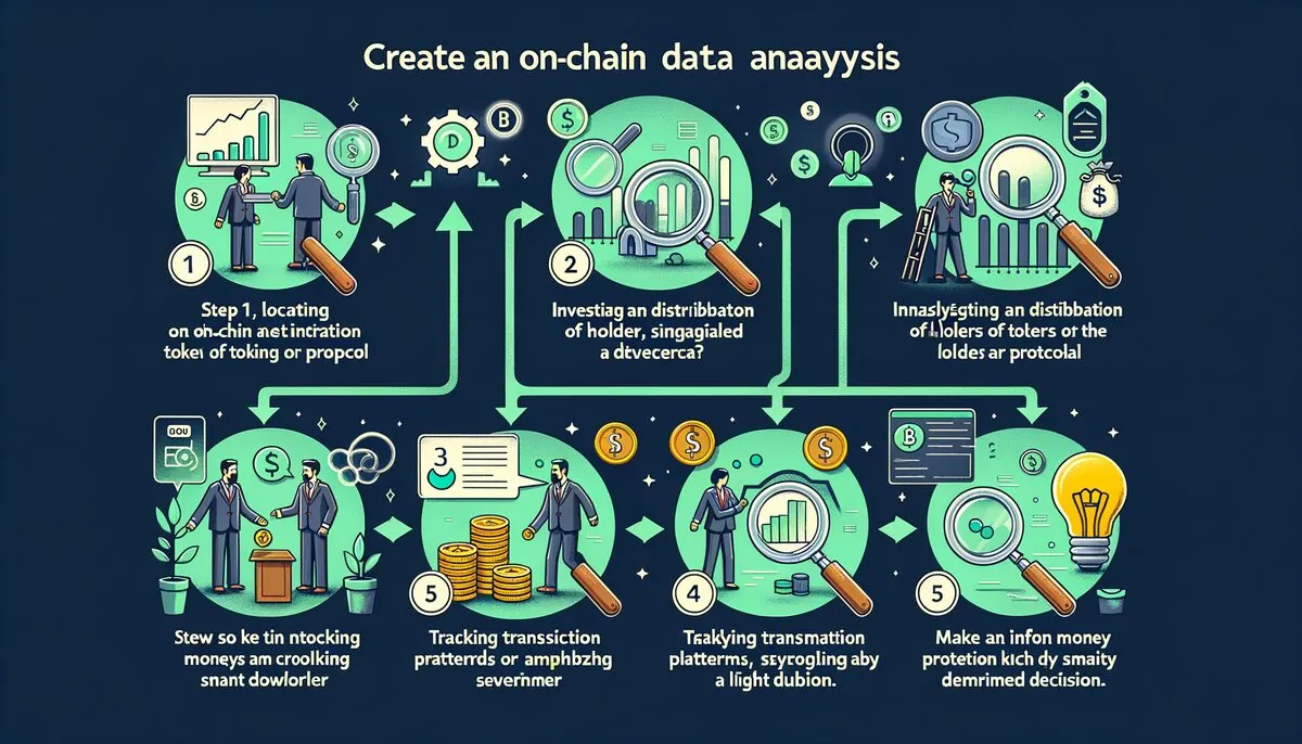
Now that you understand the key metrics and tools, it is time to build a personalized on-chain dashboard that consolidates the most important data points for your investment style. A well-constructed dashboard saves hours of manual analysis and ensures you never miss critical on-chain developments.
Step 1: Define Your Focus. Determine whether your primary interest is Bitcoin macro cycles, altcoin trading, DeFi protocol analysis, or NFTs. Each focus area requires different metrics and data sources. Most investors benefit from starting with a Bitcoin macro dashboard and then adding chain-specific or protocol-specific components as needed.
Step 2: Choose Your Primary Platform. For most beginners, a combination of Glassnode (for Bitcoin indicators) and Dune Analytics (for Ethereum and altchain data) provides comprehensive coverage at reasonable cost. Glassnode's free tier includes the most essential Bitcoin metrics, and Dune's community dashboards provide endless analytical possibilities without writing a single query.
Dashboard Setup Tip: Start simple. A dashboard with 5-7 carefully chosen metrics that you check daily is far more valuable than one with 50 metrics that overwhelms you. You can always add complexity later as your understanding deepens.
Step 3: Select Your Core Metrics. Based on the concepts covered in this guide, here is a recommended starter dashboard configuration. For macro positioning: MVRV ratio, exchange reserves (BTC and ETH), stablecoin supply on exchanges, and long-term holder supply percentage. For protocol evaluation: TVL trends, protocol revenue, unique users, and fee distribution. For trading signals: whale wallet movements, exchange inflow/outflow ratios, and SOPR.
Step 4: Set Up Alerts. The most time-efficient way to use on-chain data is through alerts rather than constant monitoring. Set price-based alerts on your key metrics so you are notified only when values enter significant zones. Glassnode supports metric-based alerts on paid plans. For free alternatives, follow on-chain alert bots on Twitter/X that post when major thresholds are breached.
Step 5: Establish a Review Cadence. Check your dashboard at consistent intervals. A daily review of macro metrics and weekly deep-dives into specific protocols or tokens provides a good balance between staying informed and avoiding data overload. Record your observations in a trading journal, noting what on-chain conditions were present before significant price moves, to build pattern recognition over time.
For advanced users comfortable with APIs, tools like Python with the Glassnode API, Dune's API, or direct blockchain node queries through services like Alchemy and Infura allow you to build fully custom dashboards and automated alert systems. The programmatic approach offers maximum flexibility but requires technical skills in data engineering and visualization.
Advanced On-Chain Techniques: Cohort Analysis and Entity Clustering
As you advance beyond beginner-level on-chain analysis, two techniques become increasingly important: cohort analysis and entity clustering. These methods transform raw blockchain data into actionable intelligence about specific groups of market participants.
Cohort Analysis: This technique segments wallet addresses into groups based on shared characteristics and tracks each group's behavior over time. Common cohort segmentation methods include: balance size (micro, small, medium, whale), holding period (short-term vs. long-term), acquisition timing (which price range or date period), and behavior type (active traders, passive holders, DeFi users). Glassnode provides pre-built cohort analysis for Bitcoin, segmenting holders into short-term holders (STH, coins held less than 155 days) and long-term holders (LTH, coins held 155+ days). The supply dynamics between these two cohorts have been among the most reliable cycle indicators in Bitcoin's history.
Advanced Concept: Entity clustering algorithms attempt to group multiple wallet addresses that are likely controlled by the same entity. By analyzing transaction patterns, common funding sources, and behavioral similarities, these algorithms provide a more accurate picture of true ownership distribution than raw address counts.
Entity Clustering: A single person or organization often controls dozens or hundreds of wallet addresses. Entity clustering uses heuristics and pattern analysis to group addresses that are likely controlled by the same entity. Common heuristics include: co-spending (addresses that appear as inputs in the same transaction are likely controlled by the same entity), change address detection, timing pattern analysis, and machine learning models trained on known entity data. Platforms like Chainalysis, Nansen, and Arkham use proprietary clustering algorithms to maintain their wallet label databases.
Understanding entity clustering helps you avoid a common analytical pitfall: mistaking one entity's activity across multiple wallets for independent market participants acting in concert. What might appear to be coordinated buying by 50 different wallets could actually be a single fund distributing tokens across its wallet infrastructure. Conversely, true coordinated behavior among genuinely independent wallets is a much stronger signal.
Common Mistakes in On-Chain Analysis and How to Avoid Them
On-chain analysis is a powerful discipline, but beginners commonly fall into traps that lead to incorrect conclusions and poor trading decisions. Understanding these pitfalls before you encounter them will save you time and money.
Mistake 1: Treating On-Chain Data as a Crystal Ball. On-chain data provides probabilities, not certainties. Even the most reliable on-chain signals have failure rates. MVRV has occasionally given premature signals, whale movements do not always precede price changes, and exchange flow data can be misleading during periods of exchange infrastructure migration. Always use on-chain data as one input among many, not as a standalone trading system.
Mistake 2: Ignoring Context. Raw numbers without context are meaningless. A $100 million whale transfer sounds dramatic, but if the receiving address is a known cold storage wallet belonging to the same entity, it has zero market impact. Always investigate the who, where, and why behind significant on-chain movements before reacting.
Common Pitfall: Beginners often see a large whale transfer on social media and immediately assume it means the price will move. Most whale transactions are routine portfolio management, not trading signals. The context and destination of the transfer matter far more than the raw amount.
Mistake 3: Cherry-Picking Metrics. Confirmation bias is the enemy of good analysis. If you are bullish on a token, it is tempting to focus only on the on-chain metrics that support your thesis while ignoring contradictory data. Discipline yourself to examine all relevant metrics, especially those that challenge your current view.
Mistake 4: Comparing Metrics Across Different Blockchains Without Adjustment. Transaction volume on Ethereum means something very different than transaction volume on Solana due to differences in transaction costs, block times, and typical usage patterns. Similarly, TVL comparisons across chains must account for differences in token valuations and double-counting across bridges and wrapped assets.
Mistake 5: Neglecting Time Horizons. Different on-chain metrics operate on different time horizons. Exchange flow data can signal short-term price movements within hours or days. MVRV and long-term holder metrics signal multi-month or multi-year cycle positioning. Using a long-term indicator for short-term trades (or vice versa) leads to frustration and losses.
Mistake 6: Overlooking Data Quality. Not all on-chain data is created equal. Some blockchain explorers may count internal transactions differently, use different methodologies for identifying exchange wallets, or have gaps in their data coverage. Cross-reference important findings across multiple data sources before making significant decisions.

Frequently Asked Questions About On-Chain Data
What is on-chain data and how is it different from market data?
On-chain data is information recorded directly on a blockchain, including transactions, wallet balances, smart contract interactions, and token transfers. Market data, by contrast, comes from exchange order books and includes price, volume, and order flow information. The key difference is that on-chain data shows what is happening at the wallet and protocol level, while market data shows aggregate trading activity. On-chain data reveals the behavior of individual participants (whales, institutions, retail), providing insights that are invisible in market data alone. For example, market data shows that Bitcoin's price dropped 5%, while on-chain data reveals that the drop was caused by a single whale depositing 10,000 BTC to an exchange.
Do I need coding skills to analyze on-chain data?
No, coding skills are not required for most on-chain analysis. Platforms like Glassnode, Nansen, and Etherscan provide pre-built dashboards and visualizations that require zero technical knowledge. Dune Analytics has added AI-assisted query generation in 2026 that translates natural language questions into SQL queries, making it accessible to non-programmers. However, coding skills (particularly Python and SQL) become valuable when you want to build custom analytics, automate data collection, create unique indicators, or access raw blockchain data through APIs. Consider learning basic SQL if you plan to use Dune extensively, as it unlocks the full potential of the platform.
Which blockchain has the best on-chain data availability?
Bitcoin and Ethereum have the most comprehensive on-chain data ecosystems, with the widest range of analytics platforms, metrics, and historical data. Bitcoin benefits from its UTXO model, which enables uniquely detailed supply analysis and coin-age tracking that is not possible with account-based chains. Ethereum's rich smart contract ecosystem generates detailed DeFi, NFT, and protocol-level data. Solana, Avalanche, Polygon, and Arbitrum have rapidly improving data coverage, particularly through Dune Analytics. Newer Layer 2 networks and alt-L1s may have limited analytics coverage, meaning you may need to rely on direct blockchain explorer data rather than pre-built dashboards.
How reliable are whale tracking alerts for trading?
Whale tracking alerts are a useful data input but should never be used as standalone trading signals. Studies suggest that only about 30-40% of large whale transactions have direct price impact. Many whale movements are internal transfers, cold storage reorganizations, or exchange rebalancing that have no market implications. The reliability of whale alerts improves significantly when you filter for specific patterns: whales depositing to exchange addresses (potential selling pressure), whales withdrawing from exchanges (accumulation), and multiple unrelated whales moving the same token in the same direction within a short time window. Always investigate the context behind a whale alert before acting on it.
What is the MVRV ratio and how do I use it?
The MVRV (Market Value to Realized Value) ratio compares Bitcoin's current market capitalization to its realized capitalization, which values each coin at the price it last moved on-chain. When MVRV is above 1, the average holder is in profit; below 1, the average holder is at a loss. Historically, MVRV above 3.5 has coincided with major cycle tops (extreme greed), while MVRV below 1.0 has marked cycle bottoms (extreme fear). To use MVRV effectively, treat it as a long-term positioning indicator rather than a timing tool. When MVRV enters extreme zones, begin adjusting your portfolio allocation gradually rather than making all-or-nothing bets on a single reading.
Can on-chain data predict rug pulls and scams?
On-chain data can identify many red flags associated with rug pulls and scams, though no method is 100% reliable. Key warning signs include: deployer wallets retaining a large percentage of token supply, liquidity pool tokens that are not locked or burned, smart contracts with hidden mint functions or blacklist capabilities, token distribution heavily concentrated in connected wallets, and team wallets beginning to sell shortly after launch. Tools like Token Sniffer, GoPlus Security, and Etherscan's contract verification status can help screen for these risks. Always check whether a token's smart contract has been audited and whether the liquidity is locked before investing in new projects.
How often should I check on-chain data?
The optimal frequency depends on your investment style and time horizon. Long-term investors can benefit from weekly on-chain reviews focused on macro indicators like MVRV, long-term holder supply, and exchange reserves. Active traders may check key metrics daily or set up real-time alerts for specific thresholds. For most beginners, a daily 15-minute review of a curated dashboard is sufficient. The danger of checking too frequently is overreacting to noise and short-term fluctuations. Set up alerts for extreme readings on your most important metrics, and let the alerts come to you rather than constantly refreshing dashboards. This approach keeps you informed without becoming a distraction from your broader investment process.
What is the difference between Dune Analytics and Glassnode?
Dune Analytics and Glassnode serve complementary but different analytical purposes. Dune is a SQL-based query platform where users write custom queries against raw blockchain data and share results as community dashboards. It supports 20+ blockchains and is strongest for protocol-specific analysis, DeFi metrics, and custom research questions. Glassnode is a pre-computed metrics platform focused on Bitcoin and Ethereum, offering proprietary indicators (MVRV, SOPR, NVT, etc.) with institutional-quality data resolution and research context. Think of Dune as a data warehouse where you build your own analytics, and Glassnode as a curated research platform with ready-made insights. Most serious analysts use both: Glassnode for Bitcoin cycle positioning and Dune for everything else.
Is on-chain analysis useful for altcoins or just Bitcoin?
On-chain analysis is valuable for altcoins, though the available metrics and analytical frameworks differ from Bitcoin. For ERC-20 tokens and other smart contract platform tokens, the most useful on-chain metrics include: holder distribution and concentration, exchange inflows/outflows, smart contract interaction counts, whale wallet accumulation patterns, and DeFi protocol-specific metrics like TVL and revenue. The challenge with altcoin on-chain analysis is that smaller tokens have less analytical infrastructure and platform support. Dune Analytics is the best tool for altcoin on-chain analysis because its SQL-based approach allows you to query data for any token that exists on a supported blockchain, regardless of whether a dedicated analytics platform has built pre-made dashboards for it.
How do I identify accumulation zones using on-chain data?
Accumulation zones are identified by a convergence of multiple on-chain signals. Look for: exchange reserves declining (tokens leaving exchanges to private wallets), the number of addresses holding above certain balance thresholds increasing steadily, long-term holder supply growing as a percentage of total supply, SOPR values near or below 1.0 (indicating holders are not taking profits), stablecoin reserves on exchanges increasing (dry powder accumulating), and whale wallets adding to positions during low-volatility periods. The strongest accumulation signals occur when these metrics align during periods of negative retail sentiment and low media attention. No single metric defines an accumulation zone; it is the convergence of multiple independent signals that creates a high-conviction setup.
What are the best free tools for on-chain analysis in 2026?
Several excellent free tools provide robust on-chain analytical capabilities. Etherscan (and its chain-specific variants like BscScan, Arbiscan) offers comprehensive transaction and wallet data for free. DefiLlama provides the best free TVL tracking across all DeFi protocols and chains. Dune Analytics has a generous free tier that allows you to explore thousands of community-built dashboards and run basic queries. Glassnode's free tier includes essential Bitcoin metrics with daily resolution. Blockchain.com and Mempool.space provide excellent free Bitcoin network statistics. For token-specific analysis, DEXTools offers free real-time trading data and holder metrics. These free tools, used in combination, provide more than enough analytical power for most retail investors to develop a significant informational edge.
On-chain data analysis is a skill that improves dramatically with practice. Start with the free tools mentioned in this guide, focus on understanding a few key metrics deeply rather than spreading yourself thin across dozens of indicators, and build your analytical framework gradually. The transparency of blockchain technology gives every participant access to the same data; your edge comes from interpreting it better and faster than the crowd.
Related Guides
- How to Use Glassnode: Read Bitcoin On-Chain Metrics Better (2026)
- Zapper Tutorial: Navigate DeFi Dashboards and Manage Multi-Chain Portfolios (2026)
- How to Use Dune Analytics: Build Better Crypto Dashboards and On-Chain Research (2026)
- Spot Real Demand vs Frenzy With On-Chain Metrics
- How to Read Liquidity Pool Data Before Buying a Token (2026)