How to Read Liquidation Maps in Crypto: 2026 Guide
— By Tony Rabbit in Tutorials

Read crypto liquidation maps and heatmaps the right way: spot clusters, time sweeps and trade with edge using Coinglass, Hyblock and Hyperliquid data.
If you trade perpetual futures and have never opened a liquidation map, you are flying blind through one of the most leveraged casinos in finance. A liquidation map (often called a liquidation heatmap) turns the abstract idea of "overleveraged market" into a picture you can trade against. It shows where forced exits cluster, where the next squeeze fires, and where a slow grind suddenly becomes a vertical wick. In 2026, with perp open interest above 80 billion dollars across top venues, ignoring this layer is no longer optional.
This guide is the complete tutorial for reading liquidation maps. We cover the snippet definition, the data sources feeding the heatmap, the step-by-step workflow for Coinglass and Hyblock Capital, color-intensity logic, leverage tiers, asymmetric long versus short clusters, and the trading tactics that turn the map into a real edge. We also dig into the differentiators most SEO winners ignore: Hyperliquid on-chain transparency, the 2024 and 2025 cascade events, and how options gamma interacts with perp liq pools.
By the end you should be able to open any heatmap, identify the magnets, decide whether a sweep will reverse or extend, and combine the data with funding rate and open interest like a desk trader. Liquidation maps are powerful but they can be gamed and they are never perfectly real time. Treat what follows as the operating manual for a stress map, not a crystal ball.
What Is a Liquidation Map in Crypto?
A liquidation map (or liquidation heatmap) is a visualization that estimates the price levels where leveraged perpetual futures positions will be forcibly closed by exchanges. It reveals dense clusters of long and short liquidation orders that frequently act as magnets for price action, because forced exits inject violent one-way flow when triggered. Most heatmaps overlay these zones on a candlestick chart, with brighter or warmer colors indicating heavier estimated liquidation volume at that level.
That definition is short for a reason: the market needs a snippet-friendly anchor. Now the nuance. The map is an estimate, not a leaked order book. Public exchanges do not publish entry price or leverage per position. Heatmap providers reconstruct the picture from open interest, funding flows, recent trade volume, and a leverage-usage model. Different providers reach slightly different numbers, which is why Coinglass and Hyblock screenshots of the same hour rarely look identical.
The 30-second mental model
- Bright cluster above price: shorts will be force-bought if price tags it.
- Bright cluster below price: longs will be force-sold if price tags it.
- Symmetric clusters on both sides: expect whipsaw, not a clean trend.
- Empty band on one side: lower friction in that direction, often the path of least resistance.
A Short History of the Liquidation Heatmap
The liquidation heatmap as we know it is a relatively young product. BitMEX popularized the perpetual swap in 2016, but in those early years traders just watched the orange "liquidation feed" tickers and the famous REKT Twitter bot. There was no spatial visualization. You learned that 50,000 longs got nuked, you cursed your luck, you moved on.
The first proper heatmap product to go mainstream was Coinglass (formerly known as Bybt) around 2020 to 2021, riding the DeFi summer and the perpetual futures boom on Binance, OKX, and Bybit. The product surfaced an aggregate liquidation level chart based on open interest, funding rate, and a leverage distribution model. Around the same period, Hyblock Capital launched its institutional-grade Liquidation Heatmap, refining the methodology with leverage filters.
Between 2021 and 2024 the tooling exploded. Tradingriot turned the heatmap into core educational content, Bybit Learn published explainers, and CoinGecko added a basic liquidation feed to its dashboards. In 2024 the rise of Hyperliquid as a fully on-chain perp DEX created an entirely new category: transparent liquidation maps where every position and forced exit is observable directly from the blockchain rather than estimated.
How the Data Behind a Liquidation Map Is Built
Understanding where the numbers come from is the difference between a trader who blindly trusts a heatmap and one who reads it intelligently. Heatmap providers, with the exception of Hyperliquid native data, do not have privileged access to exchange order books. They reconstruct positions from public APIs using three primary inputs.
The first input is open interest, which is the total notional value of outstanding perpetual contracts. Open interest tells you how much capital sits in unsettled bets. When OI is rising and price is also rising, it usually means longs are stacking. When OI is rising while price falls, shorts are stacking. The provider tracks OI per exchange, per symbol, and per timestamp to estimate net positioning shifts. For a deeper look at this metric, read our guide to open interest in crypto.
The second input is the funding rate, the periodic payment that perpetual contracts use to keep their price tethered to spot. Positive funding usually means longs are paying shorts (long bias), negative funding means shorts are paying longs (short bias). Funding gives the model directional context. A market with sharply positive funding and rising OI implies an aggressive long buildup, which weighs the model toward more estimated long liquidations clustered below current price.
The third input is the leverage distribution model. Heatmap engineers assume that traders use a typical mix of leverage tiers, usually 1x, 5x, 10x, 25x, 50x, and 100x. The model assigns probability weights to each tier based on historical trade behavior. For every estimated entry at a given price, it projects the corresponding liquidation level at each leverage tier and stacks the contributions to produce the bright bands you see on the heatmap.
This tier structure is why you see the brightest, most concentrated dots stacked very close to current price. Those are the 50x and 100x positions, which need only a tiny adverse move to die. The wider, dimmer washes further out are the contributions from 5x and 10x books. When the map shows a true monster cluster, it usually means multiple leverage tiers happen to line up at the same price.
How to Read the Coinglass Liquidation Heatmap Step by Step
Coinglass is the most widely used liquidation heatmap on the internet, so let us walk through it like a real workflow. Open Coinglass, go to "Liquidation Heatmap," pick your symbol (usually BTCUSDT or ETHUSDT), and select a time window: 12H, 24H, 7D, 30D, 90D, or 180D. Longer windows capture deeper magnet zones that survived multiple sweeps. Shorter windows are tactical and reflect very recent positioning.
Next, look at the color legend. Coinglass uses a perceptual gradient from dark purple or black (low estimated liquidation volume) through orange and yellow to white (maximum intensity). The brighter the band, the more leverage the model believes is parked at that level. Your first task is not to look for the brightest dot. Your first task is to compare both sides of price. Is the brightness concentrated above, below, or balanced? That asymmetry tells you the directional bias of the leverage book.
- Step 1: Mark current price and identify the two nearest bright bands above and below.
- Step 2: Overlay your structural levels (support, resistance, prior swing highs) on the chart mentally.
- Step 3: Cross-reference the funding rate panel on the same Coinglass page. Stretched funding plus aligned cluster equals a high-conviction setup.
- Step 4: Check open interest delta over the same window. Rising OI plus rising bright cluster intensity equals fresh leverage. Falling OI means positions are unwinding.
- Step 5: Choose a tactical playbook (sweep fade, breakout chase, or stand aside). We cover these in the trading section below.
The "Liquidation Map" tab on Coinglass (a slightly different product from the heatmap) gives you a horizontal bar chart of estimated liquidation amount per price bucket. Use it when you want to see the raw dollar value at each level rather than a color gradient. For a deeper Coinglass walkthrough that also covers funding rate reading, that companion guide pairs perfectly with this one.
Hyblock Capital: The Pro Trader Alternative
If Coinglass is the public square, Hyblock Capital is the trader desk. Hyblock charges a subscription and targets serious users with higher-resolution heatmaps, true leverage filters (you can isolate the 25x band alone, for example), and additional liquidity tools like the Combined Order Book, Bid/Ask Imbalance, and the Anchored Liquidation Levels chart. Many prop desks and Crypto Twitter "OG" accounts have publicly shifted to Hyblock since 2023 because the model is tighter and the latency is lower.
The Hyblock workflow looks similar to Coinglass at first: pick a symbol, pick a window, read the bright bands. But the differentiator is the leverage isolation. If you suspect that retail is mostly stacked on 25x and 50x, you can hide the 1x to 10x noise and see the casino layer cleanly. This is gold during low-conviction ranges, because the high-leverage tiers are the ones most likely to fire first and create the initial sweep wick.
Hyblock also surfaces a "True Retail Long/Short Ratio" and a "Bitfinex Margin" panel that some traders use as contrarian indicators. None of this replaces structural analysis, but the layered context is genuinely useful. The trade-off is the price tag and the learning curve. For most retail traders, free Coinglass plus a disciplined workflow is sufficient. Hyblock makes sense once you are size-trading and your edge case is the marginal 50 basis points of timing improvement.
Color Intensity, Magnet Levels, and Liquidity Sweeps
Color intensity on a liquidation heatmap is shorthand for estimated dollar volume. More leverage stacked at a level equals a brighter pixel. The mental model that wins is: bright bands are magnets, not destinations. Price often hunts them because, mechanically, that is where the next big flow lives. Market makers are aware. Whale algos are aware. The path of price is influenced (not dictated) by the gravity of these pools.
A liquidity sweep is the act of price tagging a bright cluster, triggering forced exits, and then often reversing once that fuel is spent. This is the bread and butter of perp trading. The classic intraday pattern looks like this: a slow grind into a session high, a sudden wick that takes out the bright short cluster just above resistance, a cascade of short liquidations that pushes price further, and then a sharp reversal as the fuel runs out and spot sellers step in. The wick that takes out the cluster is the "sweep," and the reversal is the "fade."
Not every cluster gets swept and not every sweep reverses. Sometimes the sweep ignites further continuation because the cluster sat right on top of a real structural breakout. This is why combining a heatmap with chart structure is mandatory. The cluster says where the fuel is. The chart says whether that fuel pushes into a wall or into open air.
Asymmetric Long Versus Short Liquidations: Reading Bias
One of the most underused signals from a heatmap is the imbalance between long-side and short-side liquidation dollar volume. When the bright bands below price (long liquidations) significantly outweigh those above price (short liquidations), the leverage book is long-biased and vulnerable to downside cascades. The opposite condition, with dominant clusters above price, often precedes upside squeezes.
This asymmetry compounds beautifully with funding rate. Imagine BTC trading at 95,000 with the following picture: funding sits at plus 0.05 percent for three consecutive 8-hour periods (longs paying shorts), open interest has grown 18 percent over the same window, and the heatmap shows a massive bright band of long liquidations at 92,500 with only a thin band of shorts at 97,000. That is a textbook long-trap setup. The book is leaning long, paying to be long, and the magnet is below. A break of 94,000 could easily turn into a 92,500 flush.
For a deeper read on choosing direction in this kind of context, our guide on long vs short in crypto walks through the decision framework that ties heatmap reading to position selection.
Trading Tactics: Using the Map for Entry and Targets
A heatmap is only useful if it shapes actual decisions. Here are the four core tactical setups that experienced perp traders extract from the data, with the workflow for each.
Wait for price to tag a bright cluster on high volume, watch the reaction candle. If price reclaims the level within 1 to 3 candles, fade in the opposite direction. Stop just beyond the wick high or low.
Enter a trend continuation trade and use the next bright cluster as your take-profit target. The map gives you a realistic, structurally meaningful exit level.
When price breaks structure into a heavy cluster, ride the cascade for a quick scalp. Exit aggressively before the fuel runs out, because reversals are common after the cluster is cleared.
When the map is symmetric with bright clusters on both sides, expect whipsaw. The smart play is to wait for one side to clear before committing. Patience beats forced trades.
Each setup pairs with risk rules. Position sizing is the most important variable. A sweep fade in choppy conditions deserves a smaller size than a high-confluence cascade chase aligned with the daily trend. If you have never tested these mechanically, build a habit of backtesting in crypto before going live. Even a hundred replayed setups will sharpen your read on which heatmap conditions produce reliable trades for your account size.
Exchange-Specific Liquidation Maps and Binance Dominance
Not all liquidation data is created equal. Coinglass and Hyblock aggregate across Binance, Bybit, OKX, BitMEX, Deribit, Bitget, Kraken Futures, and others. But the relative weight of each venue matters enormously. As of 2026, Binance still dominates BTC and ETH perp open interest, often accounting for 30 to 45 percent of total OI on a given day. Bybit is a strong second. OKX and Hyperliquid trade off the third spot depending on the asset and the week.
The implication is that a heatmap weighted heavily by Binance flow will look different from one weighted by Hyperliquid flow. Binance has a wide retail user base and a strong presence of 20x to 50x degens. Hyperliquid skews toward more sophisticated, larger-size traders who use lower leverage but higher notional. When you read a chart, you are effectively reading a blended picture. Always check which venues your provider includes and whether you can filter to a single exchange.
For symbols outside BTC and ETH, exchange weighting matters even more. On a thin altcoin perp, a single exchange dominating the OI can mean the heatmap is essentially just that exchange's map. A 50,000 dollar long stack on Bitget can show up as a major cluster even if the symbol is barely traded elsewhere. Treat altcoin heatmaps with extra skepticism.
Cascading Liquidations: The 2020 to 2026 Case Studies
Liquidations sound abstract until you see what they do to price. Five events from the last six years are mandatory reading for every perp trader, because they show exactly how cluster sweeps escalate into market-wide cascades.
March 12, 2020 (Black Thursday): BTC dropped from roughly 7,900 to 3,800 in 24 hours, with a vertical 50 percent flush in a few hours. Liquidations on BitMEX alone exceeded 1 billion dollars in a single day. The exchange briefly went offline, which arguably prevented an even deeper cascade. Lesson: in true panic, infrastructure becomes the bottleneck and liquidation cascades can outrun the order book entirely.
May 19, 2021 (China FUD flush): BTC fell from 43,000 to 30,000 intraday. Aggregate crypto liquidations crossed 8.6 billion dollars, the largest single day in history at the time. Long clusters that had built throughout April were obliterated in a single waterfall. Lesson: when leverage stacks during euphoria, the unwind is almost always violent and asymmetric to the downside.
November 2022 (FTX collapse): BTC dropped from 21,000 to 15,500 over two weeks, with multiple sub-cascades as FTX-linked positions unwound. Bright clusters at 18,000 were cleared in successive sweeps. Lesson: when a major venue fails, competing-venue maps warp as flows redistribute.
August 5, 2024 (yen carry trade unwind): BTC dropped from 64,000 to 49,000 in 48 hours alongside a global risk-off shock. The heatmap showed heavy long clusters at 58,000 and 52,000. Both were cleared within hours. Lesson: external macro shocks can ignite cascades the heatmap alone could not predict, but once started, the bright clusters offer a useful path map.
April 2025 (alt season flush): A coordinated flush across SOL, AVAX, and major mid-caps wiped out billions in long perp positions after a Hyperliquid whale's forced exit triggered a chain reaction across CEX venues. This event was unique because Hyperliquid's transparent on-chain margin meant traders could see the cascade building in real time, a level of visibility previously impossible. Lesson: on-chain perp data is now a leading indicator for CEX liquidation cascades.
Hyperliquid: The Transparent On-Chain Liquidation Map
This is the section most generic liquidation map guides skip, and it is the single biggest change to the analytics landscape since the original Coinglass launched. Hyperliquid is a fully on-chain perpetual DEX where every position, every margin balance, and every liquidation event is visible to anyone with an API key or a block explorer. There is no model, no estimation, no probability weighting. The data is the ground truth.
What that means in practice: when you look at a Hyperliquid liquidation panel, the bright bands are not "the model estimates 12 million dollars of longs will liquidate at 92,500." The bands are "12 million dollars of longs will liquidate at 92,500, here are the exact positions, here are their leverage tiers, here is the margin remaining." This level of transparency turns the heatmap into an actual order book of forced exits.
The implications are huge. Hyperliquid data leaks the true positioning of sophisticated traders since many large players have migrated to the DEX. When you see a massive on-chain cluster build, CEX heatmaps are often underestimating total risk. MEV searchers and quant funds can now build liquidation-hunting strategies with mathematical precision, meaning the magnet effect on Hyperliquid is often stronger and faster than on CEX venues.
Coinglass and Hyblock have both integrated Hyperliquid data. The smart move in 2026 is to read the CEX heatmap and the Hyperliquid heatmap side by side, watching for divergences. When CEX shows a balanced book but Hyperliquid shows a one-sided cluster, the on-chain data often wins.
Funding Rate Correlation: The Two-Variable Check
Funding rate and liquidation maps are joined at the hip. The relationship is simple. Persistently positive funding means longs are paying to hold their positions, which signals long bias and predicts a heavier long-liquidation cluster below price. Persistently negative funding implies short bias and heavier short-liquidation clusters above price.
The high-quality read combines both. When funding is stretched in one direction and the heatmap confirms a matching cluster on the vulnerable side, you have a high-conviction setup. When funding and the heatmap disagree (positive funding but heavier short clusters above price), the picture is mixed and you should reduce conviction or wait for clarity. A simple discipline: never act on a heatmap signal that funding contradicts unless you have a strong third reason.
Options Gamma and Liquidation Interaction
Here is another layer most guides ignore: the interaction between options gamma and perpetual liquidation pools. As crypto options markets on Deribit and on emerging on-chain venues have grown to several billion dollars in daily volume, the gamma exposure of dealers (the people short or long large options books) has become a real force on price.
When dealers are short gamma (a common state during big OPEX weeks), they must buy as price rises and sell as price falls. This delta-hedging flow amplifies moves. If a price-rise dynamic happens to slam into a bright short-liquidation cluster on the heatmap, the combination is explosive. The dealer gamma flow plus the liquidation cascade can produce a multi-percent vertical wick in minutes. The same logic applies in reverse for downside flushes.
Practically, this means you should know when the next monthly or quarterly options expiry hits (Deribit publishes the calendar) and be extra alert to heatmap setups in the days leading up. SpotGamma-style analysis applied to crypto is still in its infancy but the signal is real. When perps and options both lean the same way, the moves get larger and faster than either layer would produce alone.
Risks and Common Misreads
The single biggest mistake new traders make is treating the heatmap as a deterministic forecast. Bright cluster equals target equals trade. This is wrong. The heatmap is a probability landscape. Several risks deserve explicit attention.
Not real time: Most public heatmaps refresh every few minutes, not every second. A bright cluster from 10 minutes ago may already have been partially swept. Always check whether the chart timestamp matches your trading clock.
Estimation error: Coinglass and Hyblock models can be wrong about leverage distribution, especially in unusual market regimes. After a major flush, the surviving positions are often very different from the model assumption, and the heatmap can be misleading for hours afterward.
Gameable signals: Sophisticated actors know that retail watches Coinglass. There are documented cases of large players stacking positions specifically to create a fake bright cluster, baiting retail into the wrong side of a sweep. The brighter and more obvious the cluster, the more suspicious experienced traders become.
Survivorship bias in narratives: Crypto Twitter celebrates every successful "predicted" sweep. The failed predictions vanish from the timeline. Your sample of "the heatmap always works" is biased by selection. Track your own setups with discipline.
Wrong exchange weighting: If your provider over-weights an exchange that does not match your trading venue, the map may not reflect the flows you actually face. Filter to your venue when possible.
Combine these caveats with the broader risk hygiene of perp trading: appropriate VWAP-based execution, careful position sizing, and never risking more than 1 to 2 percent of account on a single setup. The heatmap improves your read. It does not absolve you of risk management.
Tools Comparison Table: Coinglass vs Hyblock vs Native DEX Data
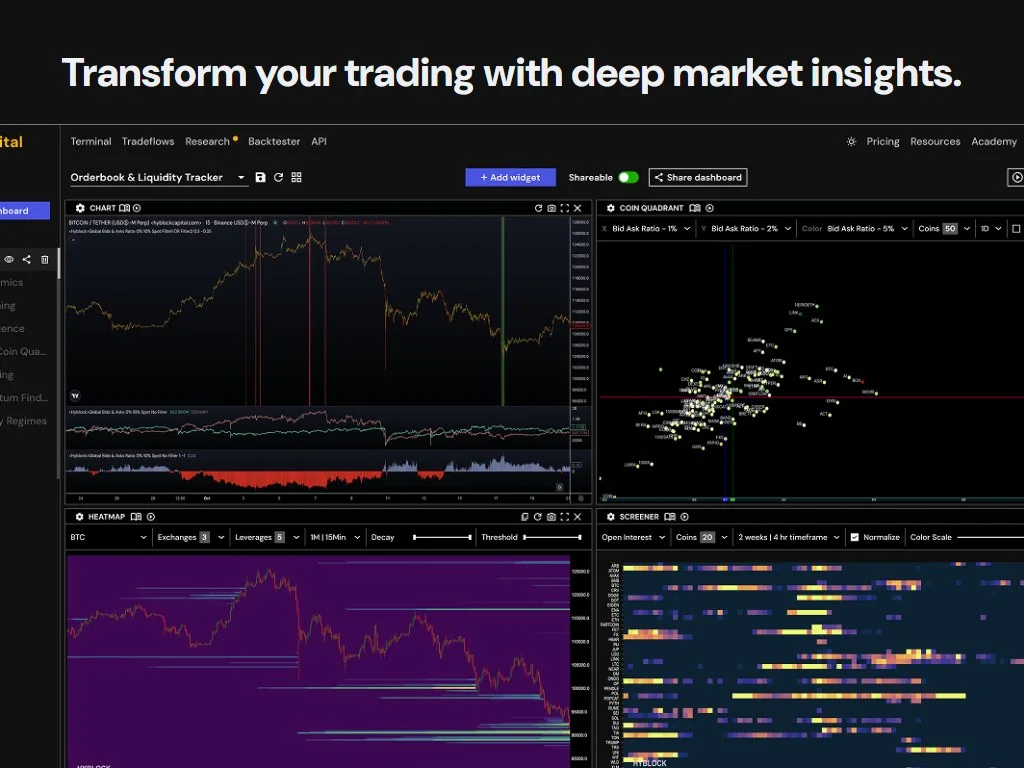
For most readers the optimal stack in 2026 is: free Coinglass as the daily-driver heatmap, Hyperliquid native data as the on-chain truth check via either the Hyperliquid app or an API integration, and Hyblock if and only if you are size-trading and need the leverage filter precision. Add a clean tradingview chart with your structural levels on top and you have a professional-grade rig for under 50 dollars a month.
CEX vs DEX Liquidation Transparency
The structural divide between centralized exchange perps and on-chain perp DEXs is now the defining axis of the entire perpetual market. On a CEX (Binance, Bybit, OKX), positions are private. The exchange knows them, but the public sees only aggregated metrics like open interest, top trader long/short ratio, and the public liquidation feed. The heatmap is a reconstruction.
On a perp DEX like Hyperliquid, dYdX v4, GMX v2, or Drift, the positions live on-chain. Anyone can query them. Liquidation engines run via public smart contracts that anyone can audit. The heatmap is the truth. This shift has been quietly profound. It moves the perpetual market closer to the radical transparency that DeFi originally promised, and it changes the game theory of leverage trading.
For most retail traders this difference is invisible because they trade on Binance and look at Coinglass. But the on-chain data shapes the broader narrative. When a Hyperliquid whale takes on a 100 million dollar short, the entire ecosystem knows. When that whale's liquidation level approaches, MEV bots, market makers, and contrarian traders all react. The result is faster price action and tighter sweeps. Expect this dynamic to spread as more volume migrates on-chain over the next 24 months. For broader context on how DeFi rails work, our DeFi guide covers the foundations.
Best Practices for Reading Liquidation Maps Like a Pro
Do
- Always cross-reference the heatmap with funding rate and OI deltas.
- Mark structural support and resistance before the heatmap goes on the chart.
- Filter to your trading venue when possible and trust on-chain data over models.
- Track your own setups in a journal to learn which heatmap conditions work for you.
- Reduce size in symmetric heatmap conditions where whipsaw is likely.
Do Not
- Treat the brightest cluster as a guaranteed target. It is a probability, not a destiny.
- Trade against a heatmap signal that funding rate contradicts without a strong third reason.
- Forget that retail-popular signals get gamed by larger actors.
- Confuse the cluster intensity with structural significance. Structure still rules.
- Use a single timeframe. Read the 24H, 7D, and 30D maps together for depth context.
Putting It All Together: A Sample Trading Workflow
Let us close the loop with a concrete end-to-end workflow you can run before every perp trade. The goal is to integrate the heatmap into a disciplined process, not to replace your existing analysis.
- Open your tradingview chart. Mark the daily and 4-hour support and resistance levels. This is your structural baseline.
- Open Coinglass liquidation heatmap for the same symbol. Identify the two nearest bright clusters above and below current price. Note their dollar values.
- Check Coinglass funding rate panel. Note the direction (long-paying or short-paying) and the magnitude (mild, moderate, or stretched).
- Check open interest delta over the last 7 days. Is the book growing (fresh leverage) or shrinking (unwind)?
- Open Hyperliquid if you trade that venue. Cross-reference whether on-chain data agrees with the CEX picture.
- Form a hypothesis: "Long-biased book, heavy long cluster below at 92,500, structural support at 93,000. If 93,000 breaks, the cascade target is 92,500. Path of least resistance is down on a confirmed break."
- Define your trade: short on retest of 93,500 after a confirmed break of 93,000, stop above 94,200, target 92,500, size 1 percent of account.
- Execute, monitor, and journal the outcome. Whether or not the trade works, the discipline of running this process compounds over time.
If you also rely on volume reads to validate breaks, our VWAP in crypto guide complements this workflow. For broader context on the institutional players who watch these same maps, see our piece on market makers in crypto.
Frequently Asked Questions
Q Q Q What is a liquidation map in crypto?
A liquidation map (heatmap) visualizes the price levels where leveraged perpetual positions will be forcibly closed by exchanges. It estimates dense clusters of long and short liquidation orders that frequently act as magnets for price action, because forced exits inject one-way flow when triggered.
Q Q Q How accurate is a Coinglass liquidation heatmap?
Coinglass is an estimate, not ground truth. The model uses open interest, funding rate, and a leverage distribution assumption to reconstruct likely positions. It is generally directionally accurate for BTC and ETH, less reliable for thin altcoins, and can be wrong by hours after major flushes when surviving positions differ from the model.
Q Q Q What does color intensity mean on a liquidation heatmap?
Brighter or warmer colors indicate more estimated leverage stacked at that price level. The brightest dots are usually contributions from 50x and 100x positions, which sit very close to price and trigger fastest. Dimmer washes further out reflect lower leverage tiers like 5x and 10x.
Q Q Q Does price always hit the brightest liquidation cluster?
No. Clusters act as magnets, not destinations. Price often hunts them but markets can partially sweep, ignore, or fade away from a cluster. Always combine the heatmap with structural levels, funding rate, and open interest. Treat the brightest cluster as a probability node, not a guaranteed target.
Q Q Q What is the difference between Coinglass and Hyblock Capital?
Coinglass is free and broadly used by retail. Hyblock is a paid subscription targeted at professional traders with higher-resolution heatmaps, leverage-tier filtering, and additional order-book tools. Hyblock generally has tighter model accuracy and lower latency, while Coinglass is sufficient for most retail use cases.
Q Q Q Why is Hyperliquid liquidation data different from CEX heatmaps?
Hyperliquid is a fully on-chain perpetual DEX, so every position, margin balance, and liquidation event is publicly observable on the blockchain. There is no estimation. CEX heatmaps from Coinglass or Hyblock are reconstructions because position data on Binance, Bybit, and OKX is private. Hyperliquid data is treated as ground truth.
Q Q Q How do I use a liquidation map for entry timing?
Wait for price to tag a bright cluster on high volume (a liquidity sweep), then watch for a reaction candle. If price reclaims the swept level within 1 to 3 candles, fade in the opposite direction with a stop beyond the wick. Alternatively, use clusters as take-profit targets in trend continuation trades.
Q Q Q Can liquidation maps be gamed by whales?
Yes. Large actors aware that retail watches Coinglass have been observed stacking positions specifically to create fake bright clusters, baiting retail into the wrong side of a sweep. The more obvious and crowded the signal, the more likely sophisticated players are exploiting it. Treat extremely conspicuous setups with extra skepticism.
Q Q Q How does funding rate interact with the liquidation heatmap?
Persistent positive funding (longs paying shorts) signals long bias and usually predicts heavier long-liquidation clusters below price. Negative funding signals short bias and heavier short clusters above price. The strongest setups occur when funding and the heatmap agree on the vulnerable side, confirming directional risk.
Q Q Q What is a cascading liquidation event?
A cascade occurs when forced exits from one liquidation cluster push price into the next cluster, triggering further forced exits in a chain reaction. The March 2020, May 2021, and August 2024 events are textbook examples where cascading long liquidations dropped BTC by 30 to 50 percent within hours.
Q Q Q Which exchange dominates the liquidation map data?
Binance dominates aggregate liquidation data for BTC and ETH perps, often accounting for 30 to 45 percent of total open interest. Bybit is the strong second, followed by OKX and Hyperliquid. The relative weighting matters because each venue has different leverage habits and user demographics, which shape the model output.
Q Q Q Are liquidation heatmaps real time?
Most public heatmaps refresh every 1 to 5 minutes, not every second. Hyblock and on-chain Hyperliquid data are closer to real time. Always check the timestamp on the chart before acting, because a cluster from 10 minutes ago may already have been partially swept.
Conclusion: From Heatmap to Edge
The liquidation map is the closest thing modern perp traders have to seeing the wiring of the market. It turns leverage from a vague worry into a spatial picture you can trade against. Used correctly, it improves your entry timing, sharpens your take-profit targets, and helps you avoid the symmetric whipsaw setups that punish impatient traders. Used badly, it becomes a slot machine, lighting up bright clusters and tricking you into chasing every glow.
The professional workflow in 2026 is layered: free Coinglass as the daily heatmap, Hyperliquid native data as the on-chain truth check, funding rate and open interest as confirmation, and structural chart analysis as the foundation. Add discipline around position sizing, journal every setup, and accept that the map is a probability tool rather than a forecast. Combine it with your understanding of funding rate, liquidation zones, and broader market context, and the heatmap stops being a Twitter screenshot and starts being a real edge.
Start small. Open Coinglass tonight, pick BTCUSDT, mark the two nearest clusters, check funding, and write down what you expect over the next 24 hours. Forming and reviewing a heatmap-based hypothesis is the fastest way to internalize the workflow. Within a month, the bright bands stop being mysterious and become useful. That is when the map becomes a tool, not a toy.
Disclaimer: This article is for educational purposes only and does not constitute investment, financial, legal, or trading advice. Liquidation maps are estimation tools and should never replace proper risk management. Perpetual futures trading carries substantial risk of loss.
Related Guides
- What Is Liquidation Price in Crypto? Explained 2026
- What Is Liquidation in Crypto? Complete Beginner Guide (2026)
- What Is a Liquidation Cascade in Crypto? Why Forced Selling Snowballs (2026)
- What Is Futures Trading in Crypto? How Leverage, Margin and Liquidation Work (2026)
- What Are Liquidation Zones in Crypto: Complete Heatmap Guide (2026)